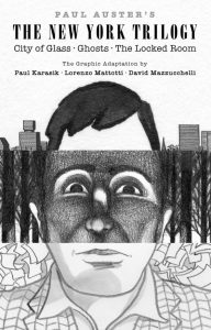
 The New York Trilogy

Based On Novels By: Paul Auster
Adapted By: Paul Karasik, Lorenzo Mattotti, and David Mazzucchelli
Publisher: Pantheon
Publication Date: April 2025
The adaptation of Paul Auster’s New York Trilogy as written by Paul Karasik has been in the works for a little over thirty years. Until now, only the first volume City of Glass has been available for purchase. What’s interesting is that the novels were adapted by three separate artists: David Mazzucchielli, Lorenzo Mattotti, and Karasik himself. As such, it is perhaps best to understand this adaptation through the lens of the three artists who helped it become what it is.
City of Glass is perhaps the most traditional of the three adaptations in terms of what one would expect from the American comic book scene. From a visual standpoint, this would be a rather shocking thing to say considering how inventive and intriguing David Mazzucchielli’s work is here. Frequently utilizing odd angles and disjointed visuals to depict New York City that feels off kilter, from dialogue balloons coming from books, pieces of shit, and dead bodies to humans who look like mannequins staged in place. In many regards, you can feel Mazzucchielli’s style shifting towards what it would become in Asterios Polyp, quite possibly the first great graphic novel of the 21st century.
Furthermore, the shadow work here is top notch, providing an air of noir uncertainty befitting of Auster’s novel. Indeed, one can see the growth on Mazzucchielli’s part from his use of shadows in his previous works in the noir genre such as Batman: Year One and Daredevil: Born Again. The black and white of the comic truly allows the shadow play here to fully envelop characters in a way color often mutes.
Interestingly, the book is published to look more like a hardcover novel rather than a traditional comic book hardcover. Its dimensions are notably smaller than the traditional comic book, though slightly larger than those of City of Glass as initially published. The result is something that, while largely aesthetic in nature, nevertheless retains the novelistic origins of the graphic novels.
What makes it feel traditional compared to the other two works in this trilogy, however, is that it uses panels. More specifically, it utilizes a nine panel grid throughout the majority of the graphic novel. Indeed, Mazzucchielli’s use of the grid frequently shifts with an oddness akin to the visuals within them, making T shapes, transforming into prison bars, among other extremely clever techniques.
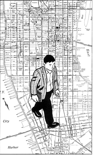
In many regards, this evokes the shape of New York City itself, or, at least, the Manhattan portion of it City of Glass largely places itself within. Its deuteriation coinciding with the deuteriation of the central character and removal from his perspective. Disengaging with the psychogeographic implications of the narrative.
This is further emphasized by Lorenzo Mattotti decision to adapt Ghosts through the lens of illustrated prose. Befitting of his background with The New Yorker, each page consists of a singular image (occasionally split up into multiple panels, but largely remaining in the form of the singular image, and some that have no images at all) contextualized with a large paragraph (or a few small paragraphs) of text beneath. The images refrain from having any text within them.
There are some exceptions to this such as the return of the nine panel grid to show an elapse of time or a climactic set of two page spreads that are rendered incomprehensible by the pdf provided (as so often happens with pdfs in the comics business alongside rather disruptive watermarks that make it nigh impossible to actually read the book at times). But still, the general nature of the illustrated prose remains. There are no dialogue balloons to guide us into the world of Ghosts.
The result is a degree of alienation on the reader, further emphasized by Mattotti’s almost charcoal approach to drawing and shading. More than even Mazzucchelli’s abstract realism, the alienation from the known engrains itself onto the reader such that we can’t quite see the fullness of the world. Only a small portion of it, as if written with a pseudonym in mind like colors or shapes.
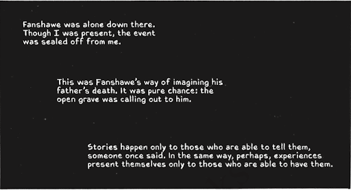
Which leaves The Locked Room, adapted by Paul Karasik himself. If there is a singular auteur at the heart of this set of adaptations (there isn’t, but it’s nice to pretend), it is Karasik. He has been writing the scripts for the past thirty some-odd years. Where Mazzucchelli approached the script with an eye towards the visual and Mattotti approached it with an oil and water approach between the visual and the textual, Karasik opts to instead approach things through a holistic textuality.
Not bound by any grid or structure, Karasik allows the text to dominate the page, frequently structuring sequences with text boxes, dialogue balloons, and the words themselves dominating the page. At one point, creating entire images composed of nothing but words. The resulting approach disorients the reader as they follow along the life of a man adrift without a paddle in an ever uncertain world.
Further disorienting the reader is the frequent tendency to cut to a completely blank page, taking the reader out of the linearity and world of the novel. There are no answers to be found within the comic, only more questions.
Which is perhaps befitting of Auster’s work, interested in the ambiguities and incompleteness of life. There are no answers, only the pursuit of further questions. And, by George, this is an extremely brilliant adaptation well worth the decades it took to complete it.
The New York Trilogy is being published through Pantheon
Read more great reviews from The Beat!

Source link