Be sure to cast your votes in the poll below; but first, let’s check out the box art designs themselves.
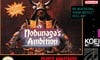
North America
Both designs here share similarities; primarily the main key art showcasing Nobunaga in his iconic Samurai armour. Here, however, the colours are a bit darker, and everything just looks a tough classier than its Japanese counterpart. That said, the title itself is just a bit… meh. Not awful, but it kind of looks out of place, y’know?
Japan
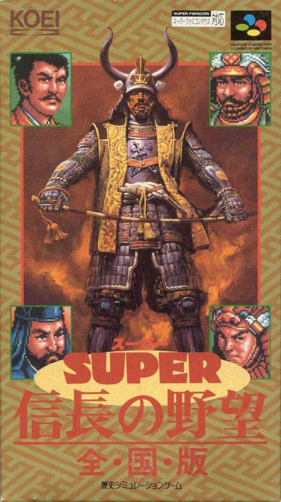
Japan’s version is, as expected, displayed in a portrait orientation, so we get to see more of that awesome Nobunaga key art. In the corners, we’ve also got pixel art images of characters from the game, which is a nice contrast. Finally, the gold mixed with the red Japanese text work really nicely together.
Thanks for voting! We’ll see you next time for another round of Box Art Brawl.