
THIS WEEK: We take a trip to the past with The Bat-Man First Knight #1. Plus, there’s a touching Keith Giffen tribute in Blue Beetle #7, Poison Ivy #20 is another brick in an excellent run, and more!
Note: the review below contains spoilers. If you want a quick, spoiler-free buy/pass recommendation on the comics in question, check out the bottom of the article for our final verdict.
 The Bat-Man First Knight #1
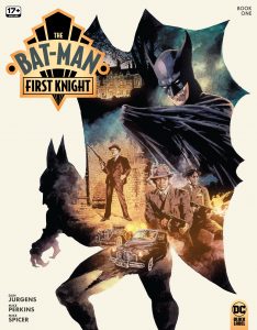 The Bat-Man First Knight #1
Writer: Dan Jurgens
Artist: Mike Perkins
Colorist: Mike Spicer
Letterer: Simon Bowland
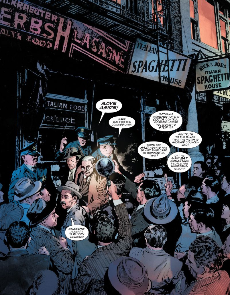
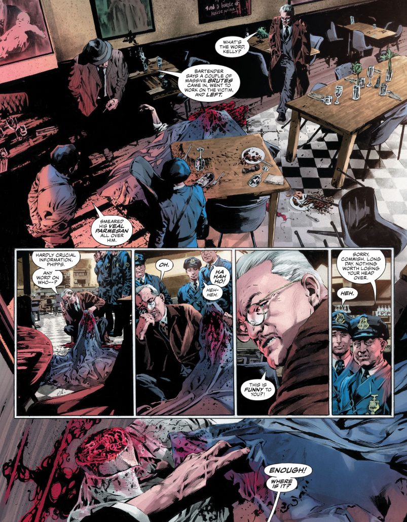
Every once in a while there’s a book that reminds you how talented and dedicated comic book artists are, from the artist to the colorist to the letterer. The Bat-Man First Knight is one of those books, loaded as it is with intricate and immersive visual storytelling from start to finish. Making it even more impressive is that this is a period piece, requiring a uniform bygone aesthetic throughout, but the book nails it. Yes, much credit is due here to Mike Perkins, who is colored by Mike Spicer and lettered by Simon Bowland.
The concept behind The Bat-Man First Knight is relatively simple. It’s basically DC Universe historical fiction, telling the story of Batman’s first appearance at the time it was first published, back in 1939. But it does so with the benefit of historical context, and, of course, decades of evolution in comic book making. Think of it as a movie made today about 1939, versus a movie made in 1939, and that’s essentially what you’re getting with this comic. And the book sets this scene with a two-page establishing spread of newspapers.
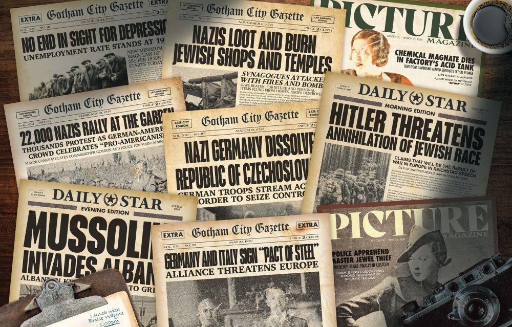
It’s a book scripted knowing that, yes, World War I is over, but also that World War II and the post-war era are on the way. It’s an interesting way to approach Batman, but it doesn’t really work if the art doesn’t go detail-heavy to capture the era perfectly. And, as noted above, the art here goes above and beyond. I was almost shocked with how impressive this book looked throughout, from the way splash pages like the one below are lit and framed, to the old-timey expressiveness of the facial acting.
And the scripting is for the most part in synch with this prestige comics art trip back in time. In fact, I almost didn’t want Batman to show up, that’s how immersive the world and its pulpy mystery felt, but, of course, he has to, and it’s fine. Batman also looks great here, with his old purple gloves and longer ears.
The story involving Batman injects more horror pulp than I was maybe expecting, but that’s not a bad thing. Like the rest of the book, it reads well and looks great. The colors and lettering in particular really accentuate the pulp action once it gets going, seamlessly transitioning the proceedings from the more subdued beginning to the cartoonier second and third acts.
It all adds up to a Batman comic that is somehow both more grounded and more over-the-top than one might expect, sort of perfectly in synch with the sensibilities of the time in which it is sent, while self-aware enough to look ahead. I enjoyed it quite a bit, first for the high level of comics making craft involved and second for the story, which was a little less noteworthy to me. Still, I think fans of well-done comics should pick this one up and bliss on the absurd heights hit by this artwork.
Verdict: BUY
The Round-Up

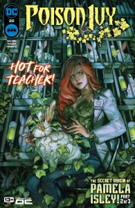
 My favorite unlikely success story in recent memory is that we’re now on issue #20 of Poison Ivy, with at least six more on the way (I saw the writer teasing a script for Poison Ivy #26 recently on social media). This book is proof positive that if a series is good enough, it can find an audience (even in today’s difficult marketplace) and get a longer life than you might expect. This issue is a good example of everything that works with this book, loaded as it is with great art, great characterization, and unified interesting themes from throughout the run. Poison Ivy #20 was written by G. Willow Wilson, with art by Marcio Takara, colors by Arif Prianto, and letters by Hassan Otsmane-Elhaou.
 - I don’t have much intellectualizing to do about it (which is totally fine), but Kneel Before Zod is awesome. Now on its third issue, this is the exact gritty kick-ass space Krpytonian saga comic you’ve always wanted. It looks great and reads like a gut-punch of sci-fi badassery. Kneel Before Zod #3 was written by Joe Casey, with art by Dan McDaid, colors by David Baron, and letters by Troy Peteri.
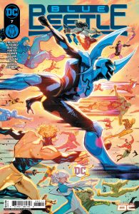
- Finally, a group of excellent creators came together this week for a special tribute to the late Keith Giffen in Blue Beetle #7. The issue was penned by regular series writer Josh Trujillo, and the rest of the regular creative team was also involved, including artist Adrian Gutierrez, colorist Luis Guerrero, and letterer Lucas Gattoni. But they’re joined by artists Natacha Bustos, Howard Porter, Cully Hammer and Scott Kolins, with colorist Laura Martin. These guest creators come aboard to help with sequences that pay homage to Giffen’s many highlights from his time with DC Comics, from Justice League International to the Legion of Superheroes to Lobo. It all makes sense in the context of the book — Booster Gold shows up to enable — and it’s such a sweet way for superhero comics to say goodbye to one of its giants.
Miss any of our earlier reviews? Check out our full archive!
Related
Source link