This week the Wednesday Comics Reviews team is looking at the penultimate issue of Michel Fiffe’s masterpiece with Death of Copra #4, the tantalizing warm-up for Bad Idea’s big swing with Planet Death #0, and Image Comics new series, Lost Fantasy #1, among other releases. We also look ahead at a new title eligible for pre-order, with Umbrella Academy – Plan B #1. Plus, as always, The Prog Report!

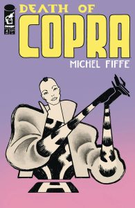
 Death of Copra #4
Cartoonist: Michel Fiffe
Publisher: Image Comics
Review by Harrison Stewart
Finality is a foreign concept in most superhero comics. Reboots/creative shake-ups are frequently announced before the current run even wraps, resulting in a frustrating lack of character development or even regression. One could argue such ever-expanding story balloons come with the territory, but I’ve often felt a sense of unrealized potential in the ongoing superhero format. After all, why give creators access to the toy chest if they aren’t allowed to really play? Sometimes, you have to bend the toys. Sometimes, you have to let them break.
With Death of Copra, Michel Fiffe breaks more than just toys. Conventions, expectations and (most especially) hearts are left in shambles by the time you reach the final page. Reading this book is like taking an unavoidable punch in slow motion. You know it’s going to make contact. The only questions are where and how badly will it hurt?
Fiffe gives no quarter in his breakneck march to the end. Plot armor affords little protection and often fails in spectacular fashion. And therein lies the greatest strength of Copra: actions have real and permanent consequences. For 45 savage issues, Fiffe has painstakingly trained his audience to expect no deus ex machina. But now the stakes have never been higher. Characters’ conflicting agendas, personal vendettas and simple mercenary impulses, hitherto running parallel to one another, can no longer coexist. A world-shattering collision is imminent and the resultant anxiety is palpable.
Whereas many series finales across media can feel like checklists of obligatory but ultimately inconsequential character deaths, Fiffe lets the story dictate the toll. There is little deference to fan service or sentimentality to be found in these pages. Such an approach will likely be divisive with some readers, but it’s remarkably refreshing to see a creator take the story where it needs to go rather than where the audience would like for it to end. To do otherwise would be an abdication of trust between the reader and an artist who promised us brutal honesty. Promise kept.
To be the writer/creator of such an expansive and imaginative project would be impressive enough in its own right. But Fiffe takes it a step further, serving as the sole creative on the title. Writer, penciler, inker, colorist and letterer is a staggering amount of hats to wear all at once, and one would expect a few of these categories to suffer under the weight. Not so with Fiffe. Every word, every line, every brush stroke feels hand selected with the utmost care and respect for readers. He has fine tuned his unmistakable style over the course of the series to the point of utter perfection, building on the strength of past success while still holding room for occasional experimentation. This is the confidence of a creator who knows exactly who he is and what he wants to accomplish, delivering thrilling, emotional storytelling page after page.
Death of Copra hit me like an atom bomb the first time I read it. And in the ashes of all that was destroyed, I felt tempted to resent the price it demanded. But as I considered it, sat with it, read it again and again, that resentment evolved into one of the deepest appreciations I’ve felt toward a comic. Revenge, violence, secrecy, all these things have repercussions, and Fiffe refuses to let his characters off the hook. And in the end, he is exactly right. This is the finale they deserve, the truth we need to hear. To those who have been with Copra from the beginning, steel your hearts for an exacting conclusion. To everyone else, you owe it to yourself to experience one of the greatest achievements in modern superhero comics.
The time has come. The end is here. Let it happen.

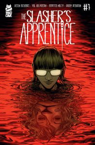
 The Slasher’s Apprentice #1
Written by: Justin Richards
Art by: Val Halvorson
Colored by: Rebecca Nalty
Lettered by: Buddy Beaudoin
Publisher: Mad Cave
Review by Ricardo Serrano Denis
Slashers are not just their kills, but when they get creative with them they tend to be memorable. Freddy’s dream murders, Jason’s brutal dismemberments, Michael Myers posing his victims (when he wants to get a point across), Hannibal Lecter’s sophisticated carnage, they all have that extra bit of violence that elevates their horror. Justin Richards and Val Halvorson have found something close to this with their slasher, The Hopton Valley Killer, for their new five-issue miniseries The Slasher’s Apprentice. And if the first issue is any indication, people are going to die in a myriad of nasty ways.
The Slasher’s Apprentice follows Riley, a podcaster who’s obsessed with slashers. An event earlier in life explains this fixation, but there’s one death dealer in particular she’s interested: the aforementioned Hopton Valley Killer (to be referred to as HVK from this point on). This one’s never been caught, has north of 120 victims on record, and wears a creepy lion mask. The twist here is that Riley has decided to track the killer down to ask for an apprenticeship. Simply, Riley wants to be a slasher.
Little is revealed regarding Riley’s motivations, but Richards and Halvorson do present us with a character that feels like a fun puzzle to solve. How her past corresponds with the podcast, which has essentially served as a kind of diary chronicling her search for her favorite murderer, and what ultimately lies behind the presumed need to kill are surely things that will be revealed later on, but the questions the character poses from the jump are utterly fascinating.
For a brief moment, I feared the story would perhaps infringe on Dexter territory, in which the character becomes an avenging angel that fights fire with fire. But Richards and Halvorson seem to have other things in mind. Something darker lies in Riley, and it more than justifies sticking with the book to get at its secrets.
What isn’t left up to conjecture is, though, is HVK’s killing methods. And they are brutal. Richards and Halvorson seem to have settled on a Jason Voorhees-type slasher, a big hulking presence that prefers impalements and dismemberments to multiple stab wounds. Fans of the first few Friday the 13th movies will see more than a few references and homages here. The killer’s presence and physicality certainly borrow freely from the iconic slasher. All of which means that HVK’s violent tendencies skew towards brutality, the kind that leaves messy crime scenes for forensics units to comb through. To add, there’s also a kill from another slasher early on that is just creative enough to leave an impression.
Rebecca Nalty’s colors do an excellent job of keeping things slightly muted to highlight the characters and the more gruesome aspects of their dealings. Solid reds and blues dominate, going from the latter when things get bloody to the former when the horror is lurking in the shadows. It’s a simple but effective way of managing tension and dread, and Nalty pulls it off beautifully. One thing I did appreciate was that the story didn’t settle on nostalgia. The Slasher’s Apprentince doesn’t necessarily look like an 80’s slasher movie. It feels current, more realistic. It was the right choice for the kind of story the creative team wanted to tell. Too much retro-infused imagery could’ve distracted from the great character work on display.
The Slasher’s Apprentice is a great new take on the subgenre, and it might even surprise longtime fans of this type of horror. It’s already proven to be unafraid to indulge in the bloodier parts of the formula. The kills look painful, angry. The same applies to its characters. A cast of broken people with psychopathic personalities inhabit this comic’s pages, and it looks like they have the right stuff to turn human monsters into legends of their own.
Verdict: BUY!

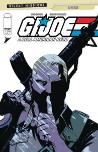
 G.I. Joe: A Real American Here – Silent Missions – Duke #1
Writer/Artist: Wes Craig
Colorist: Jason Wordie
Publisher: Image Comics / Skybound
Review by Jordan Jennings
In homage to the famous GI Joe #21 Silent Interlude, G.I. Joe A Real American Hero Duke #1 follows Duke as he goes deep into cobra territory to locate an old friend turned traitor. Will Duke be able to do what he must or will ties of friendship, however strained, prove to be too much for the Joe?
As you can tell from the synopsis, this is a silent issue that even features scant use of text in the environment.. This makes reviewing a silent issue tricky. It’s easier to discuss dialog and character motivations when it’s textual, but the second it becomes more visual it puts the onus on writer/artist Wes Craig and colorist Jason Wordie. They have to tell the story through pure sequential art and body language all well setting the mood and tone. To top it off, unlike movies and tv, there is no background music to help set the tone for the reader. It is all on the art team. It is no easy feat and there’s a reason why when it works, it becomes legendary (such as the aforementioned GI Joe #21 or New X-men #121)
Wes Craig’s art style is wonderfully nuanced in its visual language and composition. The covert ops nature of the story lends itself well to a silent issue as the silence puts us into this stealth mindset. It forces the reader to look over every detail, every change in body language, and every shadow as it could prove to be pivotal to the story. This sense of tension that Craig creates without ever typing a word is impressive. In spite of what you may think, this silent issue is far from just Duke skulking around a Cobra compound. It is action packed as it features Duke fighting with Cobra soldiers in a rather impressive all-out fight that stretches over multiple set pieces and terrain.
The burden placed on Duke’s shoulders from the mention is very evident under Craig’s line work. You can tell that Duke accepted the mission knowing it was to take out his old friend because if anyone should do it, it has to be him. The use of flashbacks during the final confrontation is masterclass storytelling to hammer the pain it causes Duke.
Jason Wordie’s color are exquisite in setting the tone of the story. A lot of dark heavy shadows and cool, muted color palette lend itself to the shadows and intrigue. The final fight at the Cobra weapons factory is just full of this atmospheric lighting that just builds up the suspense that I was sitting in awe.
Intentionally drawing parallels between your story and a well-regarded classic is dangerous. Just recently, X-Men comics played with the theme of New X-Men #121, but they opted to subvert the expectations. G.I. Joe A Real American Hero Duke #1 instead opts to play it closer to the expected and I think it was quite effective at the task. The art was more than up to the task and, while time will tell how it will hold up to its inspiration, this issue will be remembered fondly by readers and fans alike.
Verdict: BUY
Rapid Wednesday Comics Reviews
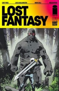
 Lost Fantasy #1 (Image Comics): This first issue of Lost Fantasy has an incredibly strong first few pages, setting up intrigue and mystery from the jump. It feels reminiscent of Something is Killing the Children, and that makes for a solid hook for interested readers and fans of that series. The mystery begins with how we meet our main character, Henry Blackheart, and then get a lore dump about how the magic in this world exists and where it connects to points in history, creating foundations for the story. There’s interesting things happening on these pages, from conversations about political and structural neglect of rural America (“Flyover states”) and the way that sets the stage for Henry’s interactions with local police. The conversations add layers of depth and authenticity to the setting and the story and then that’s elevated with the fantastical magic on display. This is definitely a strength of Curt Pires’ writing and it pulls you in deeper with the art of Luca Casalanguida, colored by Mark Dale with letters by Micah Myers. The initial lore dump helps set the supernatural stage here and then the action dials it up to ten; there is some solid choreographing and movement as the creative team fires on all cylinders moving us seamlessly from one action to the next, bursting with light and color, ending the issue with a bang. To close out the issue, we get an Indigo Children short “Indigo Children: Exodus Pt 1” which immediately made me think of the destruction of Krypton. Though I haven’t read Indigo Children, this was a great addition. —Khalid Johnson
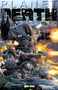
 Planet Death #0 (Bad Idea): I had a chance to read Planet Death #0 this week, and it is an effective teaser for the July launch of Planet Death #1, which is oddball publisher Bad Idea’s biggest book ever (one that they’re printing A LOT of copies of). This zero issue, as with the series itself, is co-written by comics writing vet Robert Venditti and Derek Kolstad, who is the creator of the John Wick film and TV franchise. It’s got artwork by Tomás Giorello, colors by Dave Stewart, and letters by Tom Napolitano. It’s a big swing of a book with a mighty creative team and massive publisher support. So, interest is running high. And after reading Planet Death #0, I expect that interest to run even higher. Reviewing a zero issue is kind of an odd undertaking, like a food critic writing a fully-formed take on just the appetizer of a meal. I usually center it around the question of does this comic make me want to read the main book?, and with Planet Death #0, that answer is a resounding yes. It’s a quick read, splash page of an issue, but it gets the book’s central concept across well (I think), and, perhaps most importantly, it establishes an absolutely killer aesthetic and pacing for this new series. So yeah, mission accomplished here. See you all back here in July for the landfall of Planet Death #1. —Zack Quaintance
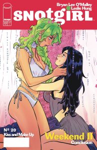
 Snotgirl #20 (Image Comics): This week saw the arrival of the extra-long Snotgirl #20, which concludes this excellent book’s recent return set of issues. Snotgirl is a book that from the start has run on a mix of vibes (as they say), one-liners, and fleeting teases of things being hidden by mysterious characters. This issue, by contrast, has quite a bit of plot. It’s maybe the densest issue of the series to date, and it manages to convey all that action without sacrificing much (if any) of the series voice. I think you can read Snotgirl on the merits of those things alone, but one of the things I find myself doing when I’m reading this comic is trying to figure out what (if anything) it wants to say about influencer culture. This issue dives deep into our main characters family story, and it got me thinking about what’s felt like a rising world attention culture in this new smart phone age. The story here connects dots back to aspirations for fame held by our protagonist’s mother and aunt in a different media time. I thought that was a nice touch. Although it’s also possible I’m reading way more into this than is actually there, and that I just personally have a strong interest in figuring out what in the world is happening with culture these days. All that aside, for me Snotgirl remains a singular, must-read comic, brought to life by clever writing and absurdly stylish art. Also, it’s worth noting here that this marks the last single issue for Snotgirl, and the 2026 set of issues from this team will be put out in a full trade, another sign of changing times, I suppose. This issue is written by Bryan Lee O’Malley, illustrated by Leslie Hung, colored by Rachel Cohen, and lettered by Iasmin Omar Ata. —Zack Quaintance
FOC Watch
This book is available for pre-order now.

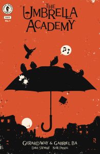
 Umbrella Academy – Plan B #1
Writers: Gerard Way and Gabriel Bá
Artist: Gabriel Bá
Colorist: Dave Stewart
Letterer: Nate Piekos
Publisher: Dark Horse Comics
Review by Jared Bird
After an excruciating six year wait, The Umbrella Academy triumphantly returns this year for its newest story arc, Plan B. The Umbrella Academy will face their biggest challenge yet: the mysterious Sparrow Academy, an alternate group of children raised in secret by Sir Reginald Hargreeves. No one can hurt you as badly as family can, after all.
Following the climatic events of the previous story arc, The Umbrella Academy: Hotel Oblivion, our weird and wonderful set of superheroes are left in a precarious situation. Tensions are high, interpersonal relationships are at an all time low, and things have gotten out of hand incredibly quickly. This immediately makes the tone of the arc feel different to previous storylines in the comic: our cast of characters are more distanced from each other than ever, whilst having to fight another set of superheroes who operate like a well-oiled machine. The first issue sets an interesting beginning for the series to continue from, exploring notions of power, control and ambition, and how violence is used to enforce personal ambitions no matter the cost. The Umbrella Academy has never been afraid to play into societal fears and anxieties, but it feels more timely than ever, very much reflecting the current state of the world. The end result feels well-realised, handling heavy themes with depth whilst still maintaining a fun and exciting tone.
Plan B marks the first story arc of the series to be co-written by series creator and artist Gabriel Bá. The result is incredibly seamless, and the arc doesn’t necessarily feel all that different to what came before. The script remains eccentric, funny and charming, all the while weaving in interesting ideas and emotional concepts. It displays all of Gerard Way’s writing quirks, but has a pointed and palpable sense of social commentary and timeliness as well. Fans of the television adaptation might be shocked at how different the comics are, but in my opinion they are well worth checking out in their own right and even now the series continues to stand out as one of the most unique superhero books on the shelves. Whilst the story moves quickly in its first issue, there are still plenty of interesting character beats that help the reader re-familiarise themselves with the series world and story. It’s a testament to how well both creators work together as a team that the story feels so seamlessly constructed throughout.
Gabriel Bá’s artwork is incredible throughout. He has such a distinct visual style, and whilst it might not work for everyone, I truly believe it to be one of the best art styles in all of comics. He has such a good sense of page layout, visual design and storytelling, with a kinetic and infectious energy that carries on throughout the entire issue. The character designs of the series continue to be fantastic and unique,ensuring that every cast member of the series feels memorable and unique. This includes the new Sparrow Academy, of which Bá does a great job at differentiating from their siblings whilst maintaining a certain level of similarity at the same time. His artwork is one of the best aspects of the series, and it’s fantastic to see that continue here.
Overall, The Umbrella Academy: Plan B is a brilliant return for the cult favorite series. Exploring ideas of power, control, ambition and violence, it feels incredibly timely and topical for the modern day whilst still fitting into the larger series well. Featuring exceptional artwork from Gabriel Bá, and an exciting story from Bá and Gerard Way, it’s fantastic to see the pair still creating new and innovative work this long since the series initially began. It’s a must-read comic for fans of either creator, and continues to demonstrate why there’s nothing quite like The Umbrella Academy.
The Prog Report
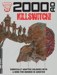
 2000AD 2450 (Rebellion Publishing): This week Prog brings an end chapter for Judge Dredd: Blitzers by writer Ken Niemand, artist Dan Cornwell, colorist Dylan Teague, and letterer Annie Parkhouse. The storyline is essentially about a set of human bombs, whose biologically buried explosives have begun to activate when they feel stressed or impassioned, which is obviously quite problematic. It’s an arc that ties back to the Judge Dredd: Day of Chaos storyline, and to me the central question is around whether one can ever move on from a certain type of past, especially if the system has written you off from the start. It’s a simple enough Dredd story, and it’s executed well (the highlight for me was last week’s penultimate chapter, which had a micro-paneled shootout that was excellent). Also, this week we get the conclusion of Chimpsky’s Law: The Truth Conundrum, which is also written by Niemand, with art by PJ Holden, colors by Jack Davies, and letters by Parkhouse. I’ve written about this strip quite a bit in this space, and with good cause — this has been my favorite comic in the Prog so far this year. I don’t want to belabor it too much further, but just consider that this last chapter starts with the line: “Somewhat usurpingly, our criminal conspiracy to mass-dose the city with a brainwash gas has not gone according to plan.” This strip is a riot. Holden’s art is absolutely perfect for the tone, and the end result is a story that will remind you how fun absurd comics can be when the folks making them are this clever. This week’s cover (above) is by Simon Davis. As always, you can pick up a digital copy of The Prog here. —Zack Quaintance
This column is compiled and edited by The Beat’s reviews editor, Zack Quaintance. Read past entries in the weekly Wednesday Comics reviews series!
Next week, we’ll be looking at some new Image Comics launches, including Blood and Thunder #1, and Free Planet #1, along with the return of the vaunted Heavy Metal Magazine! Plus, as always, FOC Watch and The Prog Report…don’t miss it!
Source link

