Welcome once again to the Marvel Rundown, The Beat’s expert analysis of the new release from Marvel Comics. Our main review this week looks at the gruesome start to the latest crossover between a Marvel character and Twentieth Century Fox monster in Predator Versus Spider-Man #1. There are Meanwhile our rapid rundown checks in on One World Under Doom and the latest issue of X-Men!
The Beat wants to hear from you, True Believers! Tell us what you think of this week’s Marvel Comics! Shout us out in the comment section below or over on social media @comicsbeat, or @comicsbeat.bsky.social, and let us know.
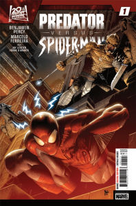
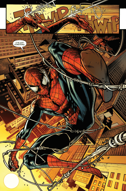
Predator Versus Spider-Man #1
Writer: Benjamin Percy
Pencils: Marcelo Ferreira
Inks: Jay Leisten
Colors: Frank D’Amarta
Letterer: vc’s Clayton Cowles
The 1990 sequel Predator 2 might be one of the craziest sequels to a bonafide classic ever made. Set in a future Los Angeles during a heat wave, cops are in a war between two gangs before a Predator shows up to murder everyone. There’s a lot of questionable representation, Gary Busey as a government expert, and an unlikely hero in Danny Glover. The urban setting though offers some interesting set pieces and visuals for the monster. It’s also brutally violent in a way its predecessor isn’t. There is a lot of dismemberment in it and gallons of dark, gooey 90s fake blood.
Normally these columns don’t come with a content warning but folks, Predator Versus Spider-Man #1 is not for the faint of heart. This comic might be the one of the most violent Marvel Comics ever released not under the MAX banner. It certainly has to be once of the most brutal Spider-Man comics released. Coming from someone who reviews horror films regularly for this site, that might be a badge of honor here.
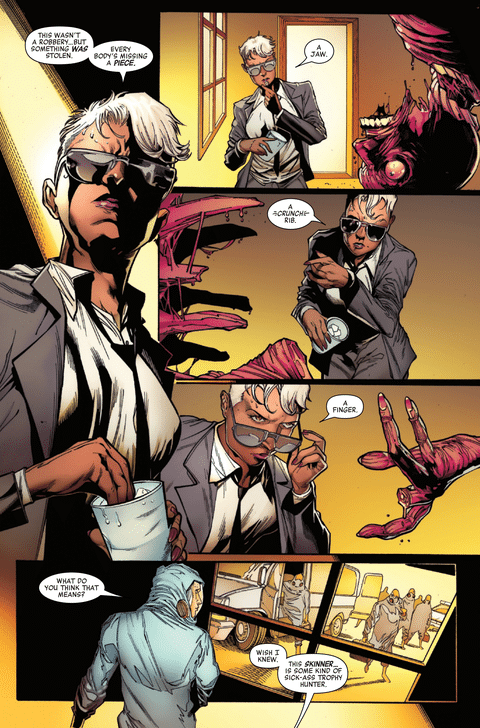
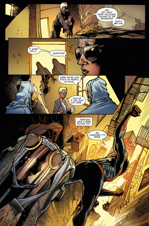
The script by writer Benjamin Percy, who has written other Predator crossovers with Marvel characters, certainly takes some inspiration from the 1990 film. There’s no Jamaican and Columbian gang fights but New York City suffers from a monster heat wave. Spider-Man and the cops track a killer who skins criminals and takes body parts as trophies. Into all of this a blackout occurs making everything worse.
Bringing all of this to gory life is the art team of penciler Marcelo Ferreira, inker Jay Leisten, and colorist Frank D’Amarta. Ferreia and Leisten revel in the violence of the script. In images more at home in a Hellraiser movie than a Spider-Man comic, flayed bodies hang as exposed bright red muscles glisten. Faces get sliced off and worn. The real star in this issue though is D’Armata. His emphasis on an orange and especially red color palette allows reader to really feel the humidity of the story’s setting. When the blood and body parts show up, there is a real visceral quality to them. His work turns this issue into a truly bloody affair.
Now this isn’t to police what should and should not happen in a comic. Creators should feel free to take story where it should go. That said there is a certain level of shock value and excess to the proceedings in this issue. It’s not that this level of violence and gore isn’t unexpected for a story involving Predator. But it’s one thing to see a flayed body for a second in Predator and another to be confronted with it on a page in a comic involving Spider-Man where a reader’s eye. Even stories involving serial killer Carnage never looked this grotesque.
That said reading a Spider-Man story that has grindhouse levels of violence is kind of fun. There’s genuine stakes here and there’s kind of no guarantee the hero will make it out entirely unscathed. Who knows what kind of fight will take place here when the hero and the monster finally meet. Still anyone coming into this thinking it will be a gentle one is in for a real shocker.
Verdict: BUY (but buyer beware)
Rapid Rundown

- One World Under Doom #3
- I can see everything writer Ryan North is trying to do and say in Marvel’s big One World Under Doom event/status quo but time and again the commentary falls flat. In attempting to reflect the disorienting feeling of a world sliding toward illiberal governance, it fails to make its villain clearly villainous. Not all of that is North’s fault, Marvel has long tried to have its cake and eat it too with Doom, giving him Saturday Morning Cartoon schemes of world domination with noble intentions and few truly heinous means to those ends. What should be a tale of compromised freedoms for the sake of selfish security instead reads like a respite from the petty cruelties of the real world. North’s well-honed comedic instincts to go for a joke sometimes undermines the drama as well. A spark comes in the issue’s final moments that hints at a second act that finally exposes Doom’s flaws and the dangers they pose. Nothing here is inherently bad, I just can’t buy into the threat I’m supposed to invest in. The art by R.B. Silva remains stunning. It’s the artist’s best, most dynamic work of his career. The big setpieces are truly stunning and the small, quiet moments feel equally weighty. David Curiel’s colors are lush and vibrant and textured, giving the sprawling visuals an extra impact and great superhero comics pop. I remain curious to see the payoff here but wish it did more to justify the heroes’ suspicions. – TR

- X-Men #15
- The flagship X-book returns this week with X-Men #15. This issue is solid action-packed story. Writer Jed MacKay has been steadily ramping up the tension and action for the last few issues (even in the non-sequitur X-Manhunt event) and its starting to hit its fever pitch this issue. It is refreshing to see the evil cabal organization finally make a move. While I am remiss to compare this current era of X-men to the previous, I do like that 3K is making actual moves against the team than the slow buildup of Orchis that took far too long. MacKay continues to play in the Morrison sandbox as well with the use of a parasitic twin. This week it’s lampshaded by having Cassandra Nova interfere with the Evil Piper twin. The art by Ryan Stegman and C.F. Villa is equally action packed but at times messy. This is the first issue of the series that FEELS rushed and the bevy of inkers lends credence to that feeling. This issue has Ryan Stegman, JP Mayer, Livesay, and C.F. Villa inking the story. Four inkers on a regular monthly book with two pencilers (who are inking their own lines) is WILD in 2025. The shipping schedule for the X-Books has been breakneck. It has help make the pace feel faster at times and allows for us to rush through the rather forgettable moments of the line, but shipping 18 issues a year (the stated goal by editor Tom Brevoort) is starting to show its flaws. Yet, as I said, the art by Stegman and Villa is solid. Their styles are compatible and the coloring by Erick Arciniega does a lot of the work to make the book look more homogenous than you would expect with an arts credit this long. The page compositions are all solid and exciting. I just can’t believe a standard-length, regular issue of FLAGSHIP SERIES is this cobbled together by committee. It’s not the worst looking X-book by far, but it is telling about Marvel’s priorities. I don’t like to make reviews about these things, but mismanagement is detrimental to the careers of these artists. Just because it works out some of the time doesn’t mean it should be done all the time. All of this aside, I really enjoyed the issue, but I don’t enjoy the ugly side of the business behind it. Hey, that’s also just like Morrison’s New X-Men. -JJ
Come back next week for more reviews or go through our archives to read past reviews from the Rundown team!

Source link