
I’m sure I’ve mentioned this before, but in the late ’90s and early ’00s, Warren Ellis posited a type of series that he termed as Pop Comics. Basically high concept limited series. Ones that introduced a focused, particular idea, and told a complete story over a relatively short period of time. Specifically as a mini-series, rather than a graphic novel, to still bring in repeat customers to the comic shops.
It wasn’t necessarily a new idea. Vertigo had published a number of such series before. Both Marvel and DC had a number of inventive minis for decades too, often meant to reintroduce a character in a new light. Grant Morrison had adopted a similar approach. As an alternative to the idea of the long-running series and the long form story as the main bread and butter of the industry. It’s weird to think that the opposite has seemingly taken over today, that the long ongoing series is the hard sell.
All of Jonathan Hickman‘s early Image series kind of adhered to this idea. Each presented a quick, self-contained story introducing a central idea and then moved on to the next. With the fifth and final of these early works, Hickman circled back to an idea from Pax Romana but from a different perspective; time travel.
“Stop being afraid of oblivion, Dom… It’s where we’re all headed.”
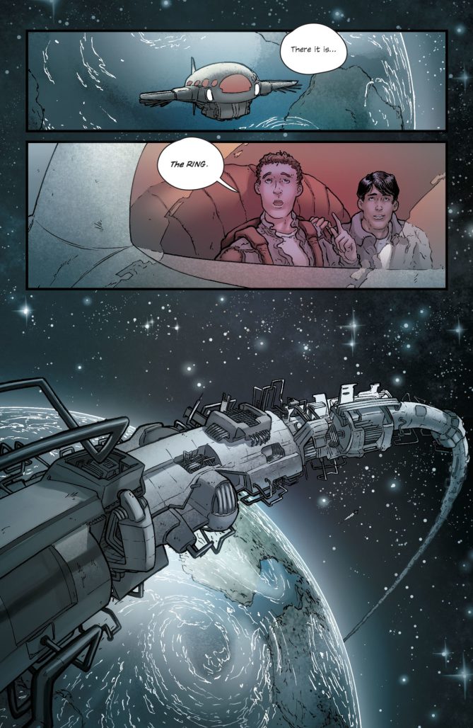
The Red Wing by Hickman, Nick Pitarra, and Rachelle Rosenberg is a tale of survival. Or attempted survival. As a war across time from an unknown enemy threatens to end all of existence. Drawn into it is a pair of cadets with familial history to the Red Wing programme and we get a lesson on time and the nature of war.
There’s an interesting moral quandary set up in the story, both in text and in subtext, of the ripples of what we effect. Of the sins of the father, whether they transcend time and space. And whether we can truly save the future by stealing from the past. It’s presented in a way that’s going to make you want to go back and re-read the series again. Pick out little bits to see how the loop, or spiral, plays out.
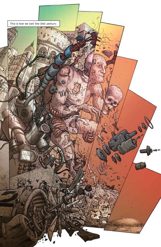
Nick Pitarra uses a style here that reminds me both of Frank Quitely and Moebius. Highly detailed, with a round, flowing line to people and clothes and a rigid line to much of the vehicles and architecture. There’s a nice blend of the two with the enemy’s tentacled war machines. It adds an alien nature to their design.
We also get a more expansive, natural colour palette for the series from Rachelle Rosenberg. It sets it apart from the more stylized colour schemes of the other early series, but I think it works well for Pitarra’s style and for the sci-fi story.
“You call what you’re doing a good thing!?!”
I think it’s interesting that we get a presentation of time as a disc here. A flat circle. Then a twist. Almost a coil. Then segmentation. To me it represents a continuous movement of understanding space and time, in story, but also in a way shows the progression of ideas in a bigger picture of Hickman’s work. How each facet, each story, feeds into a broader structure, working out those ideas in different ways later in The Manhattan Projects, East of West, House of X/Powers of X, and more.
The Red Wing by Hickman, Pitarra, and Rosenberg, like all of these Image series, stands on its own with a discrete, entertaining story, but it also hints at permutations of ideas, themes, and motifs that will be revisited in later works. Time isn’t just a flat circle.
Classic Comic Compendium: THE RED WING
The Red Wing
Writer: Jonathan Hickman
Artist: Nick Pitarra
Colourist: Rachelle Rosenberg
Publisher: Image Comics
Release Date: July 13 – October 26 2011
Available collected in Test Pattern: Jonathan Hickman Collection
Read past entries in the Classic Comic Compendium!
Related
Source link