The GLEEM collection shines bright
 Gleem
Gleem
Creator: Freddy Carrasco
Publisher: Drawn & Quarterly
Publication Date: July 2024
While Freddy Carrasco’s short story collection, GLEEM, brings us to a concerted discussion on perception and contrast, it’s important to represent the three shorts before revealing the layers that make them.
CHAPTER 1 – BORN AGAIN
In an utopic megachurch, a young boy finds nothing but boredom and psychotropics. After ingesting one drug, he finds himself thrust into a spiritual awakening that broadens his horizon as much as challenges it. Nobody enjoys being high at church.
CHAPTER 2 – SWING
Three youths straight outta Tekkonkinkreet lost a member of their streetpunk quartet to an accident. If they can find and retrieve a robotic organ from a donor, a black market doctor can revive their android friend good as new. Again… if they can find a donor.
CHAPTER 3 – HARD BODY
You’d think the club is different in a cyberpunk future, but it’s really not. Loud music, long lines, epileptic strobe lights, and substance abuse. A dude does one psychotropic in a crowded bathroom that takes him on an exhilarating adventure. Conversely, folks love being high at the club.
With that out of the way, let’s talk about how GLEEM is visually presented. Carrasco sculpts his small, visually quiet worlds in black and white only. Save some rare screentone use, fill blacks and their visual contrast with bare space is how Carrasco has chosen to communicate depth. Intimated solely through character design, his characters present black without requiring skin tone — their skin color is less important than the story/theme, so why go through the motions when their ethnicity can be implied through other visual means.
In achieving this look, Carrasco uses few rendering techniques beyond high contrast shadows. Anytime hatching is brought into the story, it’s to bring horror/gore into the context without it being the visual conversation. Characters are mostly designed with their silhouette in mind, which gives way to altering their form without pulling the reader out of immersion. In some places, this can help add movement to art that broadly exists with little to no speed lines, so actions are drawn frozen in time. Only through strong, confident linework and active layouts can Carrasco’s art carry momentum scene to scene and never stagnate.
Hell, aside from one thematically appropriate spread per chapters 1 + 2, page layouts never go full bleed, and their world is confined inside wide margins; similar to Boruto! While this could be a consequence of Carrasco’s production methods [drawing traditional > scanning digital], GLEEM’s high contrast allows a multitude of illustrative techniques to swerve its story through sheer and stark juxtaposition. From repeated shots that allows the world to move around the camera for a shot to a street lamp that isolates the chapter 2 kids from their surroundings, Carrasco prefers visual momentum and story pacing to over-rendering non-essential items.
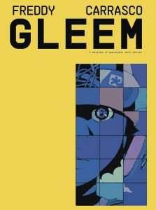
When starting chapters 1 + 2 with an extreme closeup of an eye, Carrasco is asking us to perceive and interpret events as depicted; to see what our characters see. Characters are left with nothing but their ability to perceive their environment. It’s why the missing friend in chapter 2 is an android: the playground punks don’t perceive this prototype bot as anything other than found family, so when searching for replacement parts, they conversely don’t view that reluctant bot as anything other than a means to getting their friend back. But by leaving GLEEM so visually bare, it’s a constant reminder that our perception makes this book move– a coloring book waiting to be painted in our interpretation.
Funny enough, there is some color in GLEEM. As a privilege of being juxtapose two chapters of B/W art, by adding spot color Carrasco can communicate the volume and thrust of an entire nightclub in a visually deafening manner. Any color mood would work here to communicate loud music, but by choosing cooler shades of purple, indigo, and pink hues, Carrasco can keep the atmosphere stylistically chill while symbolically signalling wealth, desperation/loneliness, and lust/attraction. However, as a consequence of its own virtuosic sequence of spreads adorned with hot cyberpunk folks waiting in line for the club, Carrasco has to use screentone to solidify their skintone and add contrast to the lineart of their outfits before the club pops off.
For a book with so much visual, GLEEM is mostly quiet. When there are word balloons, they’re hand-lettered and expressive to the character and moment in frame, though I found the sfx to look like a digital afterthought slapped atop; almost nondiegetic in that regard. As a feature, the silence in GLEEM brings this collection closer to G.I. Joe #21’s Silent Interlude than Ghost in the Shell. By actively stifling dialogue and captions, readers are subtly pushed to interpret the art, so that a new conversation can form– one where sides aren’t drawn by dialogue and plot, but brought together to share how the work made us feel. It’s a gleam of hope that asks readers to actively reflect on the imagery they consume; to GLEEM.
Read more great reviews from The Beat!
Related


Source link
 Gleem
Gleem