
This week’s main review is Minor Arcana #1, the newest book from writer/artist Jeff Lemire. Plus, the Wednesday Comics Team has its usual rundown of the new #1s, finales and other notable issues from non-Big 2 publishers, all of which you can find below … enjoy!

 Minor Arcana #1
Writer/Artist: Jeff Lemire
Letterer: Steven Wands
Publisher: BOOM! Studios
Review by Jordan Jennings
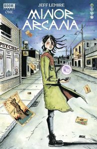
Synopsis: With her mother ill, Theresa St. Pierre returns to her hometown of Limberlost, a small fishing village along the coast, to tend for her mother. Theresa struggles adjusting to a town that has seemingly remained unchanged, reluctantly takes up the family business—Town Psychic and Tarot reader. Through this job Theresa learns that there’s more to her than she thought.
Writer/Artist Jeff Lemire’s latest series treads on familiar ground for the creator— the broken relationship between parent and offspring. While familiar in themes, Mirror Arcana #1 is still a well-executed launch to a new series. The issue focuses a lot on Theresa and her emotions of returning to the small town after failing out of the big city. This is done through Theresa’s narration of the story. She often describes scenes in a bitter and pessimistic tone that is contrary to what’s on the page. It’s obvious that she doesn’t want to be there and it’s tainting her world view.
We also get hints of Theresa’s backstory in subtle ways be it the childhood bedroom that acts like a time-capsule of her high school years, to her grandfather’s jacket she keeps in her closet as a cherished reverie, and to her struggles with addiction with her first instinct after having a fight with her mother being a trip to the local tavern. Theresa is ugly at times in her interactions with others, often belittling and coarse. Yet, Lemire makes sure that despite her cynicism that she is still viewed as a complex character. There are flashbacks to her grandpa, and we see that she feels deep sadness over a girlfriend that moved on to someone else. She is bitter, but human. Lemire has always had a touch for that, and Mirror Arcana is no different.
The art is done in Lemire’s signature watercolor style that is just gorgeous to look at. The color palate he uses is a very muted gray and blue tones. The only pops of color are the shades of Reds. Often on the focal point of the panel. It is extremely eye catching and speaks to how dreary Theresa’s world view is.
Color is a tool Lemire employees to set the tone. Be it in the flashback scene with the grandfather that is more vibrant overall with greens and other earthtones being present, or the scenes that take place in this ethereal and (intentionally) ill-defined hotel on the beach are even more muted than before with even the skin tones being swapped out for grays and blues creating a sense of depression and dread. Lemire’s a master of the craft and his use of watercolors are impressive and give this book a distinct visual style from the rest of the comics on the shelves but fits in with Lemire’s other independent work.
The layouts Lemire uses are interesting as well. Most panels are done in traditional grid format with well defined borders and gutters, there is a scene during a tarot reading that switches to a panel shaped like tarot cards that begin to lose the rigidity of the grid until literally one of the cards breaks away and drops a character in the ill-defined hotel on the beach. It is a novel trick to showcase the changes to the character’s world view and to signify to the readers that something is out of the ordinary.
Overall, Mirror Arcana #1 is a strong first issue that is beautiful to look at. I find that while Lemire is working in familiar territory, Lemire is much like a master artist works with the medium that suits them well. Sure it may be familiar but when the artist is a master at that craft you can’t help but to appreciate it.
Autumn Kingdom #1
Writer: Cullen Bunn
Artist: Christopher Mitten
Colorists: Francesco Segala and Sabrina Del Grosso
Letterer: Taylor Esposito
Publisher: Oni Press
Review by Jared Bird
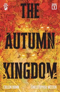
What happens when two powerhouse genre creators team up for an independent title? You get some magic, that’s what. Created by Cullen Bunn (Harrow County) and Christopher Mitten (Hellboy: The Silver Lantern Club), The Autumn Kingdom focuses on sisters Sommer and Winter, whose father is a writer of dark fantasy novels. On a family trip to a cottage in Sweden, the sisters learn that magic may be far more real, and far darker, than they think.
Whilst this premise may sound familiar to some, and does remind me a tad of The Spiderwick Chronicles novel series, it’s so well-told that you cannot help but get on board. There’s a sense of wonder and darkness to this book, striking a great balance between magical coming of age story and dark fantasy that can appeal to older readers. Fantasy is having a great year, in comics especially, and this comic is keeping up the momentum greatly.
Cullen Bunn’s writing is confident and effective. You get a good grasp on the family dynamics in a very short page count, and the characters feel real, as if they existed before the first page you saw them on. Bunn is a prolific writer, and sometimes that means individual series can feel less loved than others, but that’s not the case here – the story feels well thought out, and there’s tasteful pieces of subtle worldbuilding throughout that really help you get a grasp of the world our characters find themselves in. The proselike sections could come across badly in the hands of a less talented writer, but they flourish here. I’d read the books about The Wraithbound Queen by Sommer and Winter’s father.
Christopher Mitten’s artwork is top notch and suits this type of story beautifully. His extensive work with Hellboy universe titles shows, because he can balance the realistic elements with the fantastical ones to make an incredibly compelling overall product. Colorists Francesco Segala and Sabrina Del Grosso make the artwork shine, and overall visually this book is one of the strongest I’ve read this year. Maybe I am just a sucker for that specific visual style, but I think it’s absolutely fantastic.
Overall, The Autumn Kingdom kicks off to a strong start and makes for perfect reading as we get into the Autumn season ourselves. It’s a compellingly told, wonderful and dark fantasy story perfect for both younger readers and genre fans, and from what I can tell, it’s only going to get better as it goes on. Oni Press has been really killing it, and I am happy to see two talented creators work together on a book for them.
 Conan: Battle of the Black Stone #1
Writer: Jim Zub
Artist: Jonas Scharf
Colorist: João Canola
Letterers: Richard Starkings and Tyler Smith
Publisher: Titan Comics
Review by Ricardo Serrano Denis
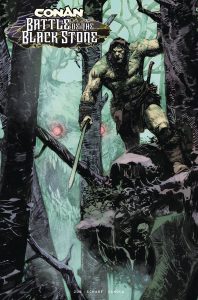
Robert E. Howard, the creator of Conan, was a master character creator. Among them you’ll find the likes of Conan the Barbarian, Solomon Kane, El Borak (also known as Francis Xavier Gordon), James Allison, Agnes de Chastillon, and occult detectives John Kirowan and John Conrad. They grew and developed in a time when magazines like Weird Tales dominated the stands, when Howard was busy making the Sword and Sorcery subgenre into an institution of its own within the world of Fantasy. They battled Lovecraftian monsters and forgotten warrior tribes with a taste for blood, threats that were dark and epic enough to turn these heroes into legends. Now they’re finally sharing a stage in Jim Zub and Jonas Scharf’s Conan: Battle of The Black Stone, a new story that is sure to make fans of Howard’s other characters not named Conan quite happy.
Battle of The Black Stone is essentially a Howard-verse story. It starts simple enough, perhaps too much so. We’re in 1930s Chicago and Detectives Kirowan and Conrad are looking for an audience with El Borak, a Texan gunfighter known for his adventures in Asia. They hope to ask him about a sigil they’ve uncovered that has no ties to known religions. El Borak is taken aback by the discovery, as if he knows about it. From there the story jumps to the Hyborian Age to catch up with Conan, 1930s Texas to check in on James Allison, 1520s France to drop in on Agnes, and 1580s Africa to look in on Solomon Kane.
The sigil affects those who see it or who come into contact with it with a rageful need for violence. Each character will have to contend with it to uncover its secrets.
The first issue of this Howard-verse collision sticks close to character introductions along with establishing the sigil as the thing that’ll bring these heroes together. Zub and Scharf do a great job at it, but a bit more plot or some further exploration of either of the characters present would’ve made for a more enticing read. As such, issue #1 feels like an issue #0 or one of those short event prelude one-shots that usually get handed out during Free Comic Book Day.
What’s here is good, though. Zub imbues each character introduction with an impending sense of doom that ramps up the tension early on. It feels appropriately serious, with the sigil signifying a shift in reality should it overpower its rivals. Scharf illustrates each character with a heaviness that captures the tone Zub is going for. They look and feel grandiose, but also mortal. It’s especially noticeable in the eyes. A lot of emotion is afforded to them to really communicate a sense that fear is creeping in just under the surface, and that the heroes are trying their best to keep it from pouring out.
Special mention goes to the lettering by Richard Starkings and Tyler Smith. Their decision to let the narration text hang over empty skies or over inky shadow areas gives off a prose-like quality that brings the storytelling sensibilities at play back to the original Howard stories. João Canola’s colors also evoke an old-school feel that keeps each character within the same narrative wavelength.
Conan: Battle of The Black Stone #1 clearly signals the start of something special should it stick the landing. It’s not often Robert E. Howards other characters get the attention his most iconic creations get. This is a chance to carve out some meaningful space for them in comics. With introductions done away with, issue #2 can easily get the ball rolling on that.
Duck and Cover #1
Writer: Scott Snyder
Art: Rafael Albuquerque
Colors: Marcelo Maiolo
Letters: Bernardo Brice & RAD
Publisher: Dark Horse Comics
Review by Clyde Hall
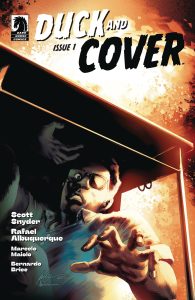
The 2023 ComiXology miniseries comes to Dark Horse, bringing its blend of mid-20th Century Americana and cinephilia. The result from writer Scott Snyder and artist Rafael Albuquerque is a captivating sci-fi adventure layering the Cold War setting with elements from films like Matinee, Super 8, Red Dawn, and The Breakfast Club. The chapters told in film genre styles are perfect for bringing the storyline and cast of characters full circle.
Because protagonist Delmont Reeves is a budding film director in 1949. He’s only 9 years old, but he’s got big plans. When his father saves up from his janitor’s job to buy the wannabe filmmaker a camera, Del along with best friends Oliver Osawa and Junior Jackson set about shooting a modest monster movie in their Colorado town, a military town owing to the missile silos near it. The film project ends in a terrible incident, but Del’s drive to become a movie maker is undiminished.
Six years later, it’s 1955. The Cold War has dropped to below freezing, and the three movie fan musketeers are preparing to graduate High School. Del’s dreams of Hollywood have evolved into a serious strategy of college film study, and he’s working as projectionist at the local drive-in for his final summer at home. After a fight breaks out on the drive-in lot, Del’s friends, their bullying tormentor, and a drag racer teen are assigned detention during school hours. Del is also present when fiery ‘mushrooms’ begin sprouting…
Snyder and Albuquerque are both on target here, touching many nostalgic elements of the post-WWII era, dwelling on others as the heart of their story. They also don’t shy away from the less shiny components, including racism and prevailing propaganda that came with escalating tensions between the U.S.S.R. and the United States.
In fact, the name of the series is derived from a Civil Defense film Del and his generation grew up seeing, one where anthropomorphic Bert the Turtle teaches kids how to protect one’s self from an atomic bomb attack. It’s dubious advice delivered with assurance and conviction, a chilling reminder of straws grasped during the era in hopes of placating an anxious, uneasy population.
Science fiction elements surface in the latter half of this premiere issue, and Albuquerque with letters by Bernardo Brice & RAD bring combat, and sci-fi film aesthetics mixed with horror, to the pages with unnerving servings of sight and sound. Marcelo Maiolo adds a slightly hazy color scheme that enhances the feel of a remembered past. The reality they weave is an effective mix. Of real world fears regarding The Bomb and invasion by ‘Others’, combined with fantastic cinematic visions which came out of that period. For Del and the other surviving teens, the aftermath they face, and the cultural escapes that film once provided by reimagining Cold War dangers as alien beings, monsters, and robots, collide.
The Duck and Cover movie industry information is accurate, the advent of nitrous oxide for racing engines of the day on point. Given its focus on such a specific era, the narrative dangles one noticeable departure from real history, though. Tech presented later in the issue may indicate certain advancements came earlier in Del’s world than ours, but mostly it’s the same.
So, this nagged me through the whole issue since it happens early on. The camera Del’s father gave him in 1949 is a ‘Modachrome 330 home video camera’. This is probably meant as a variation on the Kodak XL330 Super 8 movie camera, though the box shows Del’s camera is 16mm. The real XL330 came out in the mid-1970s. And there were no ‘home video cameras’ in 1949, either.
Home movie cameras of different types (8mm and 16mm) existed much earlier, and variations on any one of those would serve. Especially when considering the historical accuracy prevalent in the rest of the issue, this detail dropped me out of the story a bit. It sent me searching for hints that the setting might differ from our own before the atomic conflict but led me to none.
That surely won’t keep me from picking up all four issues of this series, though. I want to see what film genres future acts tackle. In the first issue of Duck and Cover, that was Melodrama. Next up? Horror. Yes, I’ll be buying a drive-in ticket for that feature.
Wednesday Comics Reviews
 Dark Empty Void #1 (Mad Cave Studios): This is a beautifully drawn first issue that opens with such a striking first image of a black hole that you can’t help but be sucked in, and then sucked into the life of Joy Frank, a woman struggling with depression especially in the wake of a failed marriage. Zack Kaplan’s writing makes the literal into metaphor, introducing us to characters who artist, Chris Shehan with colors by Francesco Segala draws life and emotional weight into. There are some spreads in here that will leave you breathless, really pushing the strong environmental work with colors across the board that have a great textural quality to them. Letterer Justin Birch gives the characters voice, bringing everything together as the story sets up quite a bit of character intrigue and questions about the black hole. It’s a great metaphor and it’s a solid first issue that is well worth your time if you’re looking for strong character work and an interesting sci-fi premise. —Khalid Johnson
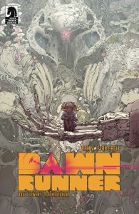
- Dawnrunner #5 (Dark Horse Comics): Call me a “RamVangelist,” because any time I read a comic book written by Ram V I want to shout its greatness from the rooftops. Dawnrunner, created with artist Evan Cagle, is a bit of a departure for V with its science fiction trappings of giant robots and kaiju. But it has all the hallmarks of Ram V’s oeuvre, notably its humanist themes and questions of morality and mortality. Cagle’s line art, the breakout highlight of the book, remains stunning in this finale. There is so much about the visuals to praise, and to focus on one element is to shortchange the work. The thin, twisting lines, meticulous hatching, and use of tones adds grit and depth to this issue’s climactic battles. Cagle’s ability to depict the scale of the titanic battles through his use of those textures is remarkable. He doesn’t shy away from the brutality of the hero’s violence, and even that helps add to the sense of size, as the Dawnrunner mech tears through its monstrous enemy.
There are some clear visual and thematic nods to Neon Genesis Evangelion throughout this series, and as this final issue draws to its conclusion and the barriers between the machines, monsters, and humanity dissolve, those only become clearer. The story could have used another issue to resolve some of its ideas more concretely and the heavy narration and montage of imagery at the end makes it feel as if V and Cagle are rushing to wrap up their ideas. That aside, Dawnrunner as a whole is a touching and stunningly beautiful looking comic that uses its big sci-fi ideas to examine ideas of memory, regret, and the alienating horror of war and violence. The color team has changed a couple times throughout the story and while Francesco Segala and Gloria Martinelli’s work is solid in its own right but loses some of the texture and eerie grain that pervaded the first two issues. Aditya Bidikar’s letters are as evocative and well-crafted as Cagle’s visuals and have elevated the story from issue one. If the worst I can say about a book is that I wanted more of it, it’s an easy recommendation. There is beauty in this moody sci-fi story that goes beyond the sum of its individually remarkable parts. —Tim Rooney
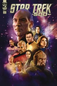
- Star Trek #500 (IDW Publishing): What better way to commemorate Star Trek Day 2024 on September 8th than with an anthology issue celebrating the Franchise comics from IDW? In a beefy 40+ page issue, Star Trek #500 celebrates several shows (including Lower Decks, even though Freeman was omitted from the main cover). Speaking of Lower Decks, the story featuring our Cali class heroes does not disappoint. “Go See Cal!” by Magdalene Visaggio, Megan Huang, Charlie Kirchoff and Jodie Troutman is a stand-out treat. I enjoyed the reference to the 3-issue Lower Decks miniseries (Hologram Dracula 5-ever). And like the show, this comic is funny while foregrounding the post-capitalist nature of Star Trek’s future. Plus, the influence of Deep Space Nine is clear. Qapla’! Speaking of Deep Space Nine, the short but sweet “Latinum Glove” by Mike Chen, Angel Hernandez, Nick Filardi and Troutman follows up on the excellent Deep Space Nine miniseries “Dog of War.” And what can I say about “I Knew You Were Tribble When You Walked In” by Jordan Blum & Patton Oswalt, Leonard Kirk, Lee Loughridge and Troutman? I don’t want to spoil any surprises, but this is a story that remembers Kirk’s butt smushed a Tribble on the Enterprise bridge, and I don’t know what else you could ask for. That’s not all, either. “The Unexpected Mentor” by Stephanie Williams, Tench, JP Jordan and Troutman gives us a welcome chance to visit again with Captain Burnham, who should headline more comic stories. “Yesterday’s Shadow” by Jody Houser, Vernon Smith, Kirchoff and Troutman is a fascinating exploration of the fallout from the Strange New Worlds season 2 episode “Tomorrow and Tomorrow and Tomorrow.” And in “What’s a Q to You” by Morgan Hampton, Megan Levens, Kirchoff and Troutman, we get a sequel story to Voyager’s “Q2” which follows up with Q Jr. using the kind of metafiction that only works in comics. Just like Star Trek: Celebrations #1 earlier this year, this anthology is a must-read, filled to the brim with sequential graphic narrative Franchise goodness. Also just like that anthology, I commend the IDW Star Trek group editor Heather Antos for assembling an absurdly talented and impressively diverse group of creators. Finally, I want to give another shout-out to Troutman, who lettered all but one of the included stories. She’s continuing to knock it out of the park with meaningful, unique lettering for each individual show’s style. And as Dayton Ward mentions in the essay that wraps up this issue, I can’t wait to read Warp You Own Way later this fall! —Avery Kaplan
The Prog Report
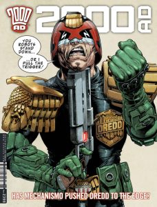
 2000AD Prog 2398 (Rebellion Publishing): “The robots have taken over and it’s time to fight back!” …is the simple-but-excellent opening to Judge Dredd: Machine Rule 07, the final chapter of what’s been a great story that speaks to the current moment that we’re having in our real world with AI. This story (which I’ve written about a couple times in this space previously) is written by John Wagner, illustrated by Colin Macneil, colored by Chris Blythe, and lettered by Annie Parkhouse. To some extent, it works for me because I don’t think I am capable of getting all that tired of man vs. machine stories, but at the same time, it really speaks volume that this is so freshly relevant. What I really enjoyed about this final chapter was how Dredd sort of used the limits of the machine logic against them, which seems to have (hopefully) undone generative AI a bit in our own lives. Anyway! This was a fun story, very much worth catching up with. As always, you can nab a digital copy of this week’s Prog here. —Zack Quaintance
Read more entries in the weekly Wednesday Comics reviews series!
Source link