
This week the Wednesday Comics Reviews team tackles the start of a couple insect-themed books with Bug Wars #1 and The Hive #1, as well as looking ahead at more forthcoming titles with Dark Pyramid #1 and Out of Alcatraz #1. Plus, as always…The Prog Report!
Are you a weekly comics sicko? You’ve come to the right place. This is where The Beat’s review team writes about the new #1s, finales, series still within preorder eligibility, 2000AD’s weekly magazine, and other notable issues out in shops from non-Big 2 publishers…enjoy!

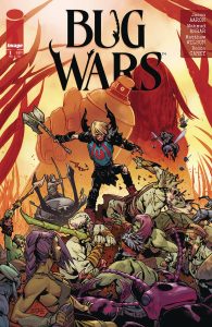 Bug Wars #1

Writer: Jason Aaron
Artist: Mahmud Asrar
Letterer: Becca Carey
Colorist: Matthew Wilson
Publisher: Image Comics
Review by Jared Bird
Slade Slaymaker is a regular kid who’s whole world changes as he gets caught up in a vicious and fantastical world beyond what he ever could’ve imagined. Bug Wars is a new miniseries from the killer team of Jason Aaron and Mahmud Asrar, behind series such as Marvel’s Conan The Barbarian, telling a violent and epic urban fantasy story with a beating heart at its centre.
Slade Slaymaker has just moved, alongside his mother and traumatized, bug-hating older brother, back into the house where his father died. He’s just trying to keep his head down and settle in, but a series of events turns his life upside down, leading him to a fantasy world where warriors fight for territory on the backs of beetles and ants. Blending Studio Ghibli style hidden world fantasy with violent, epic sword-and-sorcery influence, Bug Wars is both exciting and heartfelt. At its core, it’s a coming of age story about Slade, except he has to fight for his life against mysterious bug-riding fighters in order to process how hard it is to grow up.
I’ve always been a fan of Jason Aaron’s style of dark fantasy comics, but this book feels relatively unique amongst his catalogue. It takes the violent, epic influences seen in series such as Thor: God of Thunder or Conan the Barbarian and plays with it, where the bloody sagas of our fantastical world are in reality, so small you might miss it. There’s a sense of fun and care put into the book, and it feels like Aaron gets to let loose and just enjoy himself as a writer. There’s a couple elements that are almost campy, but played with such sincerity and heart that you can’t help but buy into it. It’s unapologetically a fun, cool fantasy story, which is refreshing in a time of overdosing on ironic media.
The artwork by Mahmud Asrar is top notch. Asrar manages to be great at both core elements of the book, balancing the fantastical and violent with the quiet and intimate. He has an incredible understanding of scope and scale, making the conflicts in the fantasy world feel epic and impressive even if it involves bugs and tiny objects. This contrasts well with the emotional personal drama, which is done with care and in total opposition to the style of violent conquest seen during the ‘war’ sections of the comic.
Overall, Bug Wars kicks off with a strong start. It’s stylish, epic and cool, whilst having a solid emotional centre that fleshes out the series beyond its initial familiar premise. With strong, bloody artwork from Mahmud Asrar and good writing throughout by Jason Aaron, this will absolutely appeal to fantasy genre fans. Whilst the first issue only touches briefly on worldbuilding and its central mystery, it lays out solid hooks for the rest of the story and doesn’t push too much on the reader too early. Those less familiar with fantasy tropes and conventions might not be initially sold, but there’s enough of a genuinely heartfelt emotional throughline that the book will undoubtedly win them over by the end of the first issue.
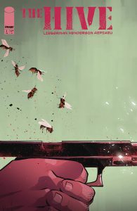 The Hive #1

Writer: AJ Lieberman
Artist: Mike Henderson
Colorist and Letterer: Iñaki Azpiazu
Publisher: Image Comics
Review by Jordan Jennings
Synopsis: The Hive is a criminal syndicate led by the ruthless Queen. The name is more than just creative theming for the group as it is shown that the “worker bees” and Queen possess some sort of mind control power like The Voice from Dune that aide them in their illegal activities. The story follows Mason and a team of rogue worker bees that attempt to escape the Queen’s control.
The Hive #1 is a sleek but confusing comic. The story structure by AJ Liberman is the main factor to this confusion. It opens with Queen Bee passing judgement on a group of workers but then immediately jumps into a flashback. The confusion could be the intent and may work better in collection, but it left me flipping back and forth between pages trying to understand which characters are which. This isn’t helped by the art design. While Mike Henderson’s art is sleek and polished, the characters lack any real visual distinction.
To be honest, the issue opening with Queen passing judgement on the rogue worker bees undercuts any sense of suspense or intrigue that it is trying to be established later with their introduction proper. Knowing the end results for a character isn’t always a bad thing, but with lack of visual distinction making it the characters’ death and introduction less impactful in both directions. These aren’t established characters, and we don’t get much in terms of characterization to make them stand out.
One thing working in The Hive #1’s favor is the vibe that Henderson and Iñaki Azpiazu evoke with their art. While the art is sleek, there is a grimy vibe that compliments the heist story. The colors are all warm in their hue with many of them being earth tones. It gives the sense of grounded realism to the story. Unfortunately, the use of all the warm tones sometimes contributes to the visual confusion of the comic. It makes the pages look very homogenous visually. The vibes are great! I just wish I could visually follow the story and feel the impact as I believe it was intended to be felt.
The Hive #1 has elements that work well for it be it the vibe or sleek production values, but it is weighed down by poor storytelling decisions and a homogenous art direction that only compounds the storytelling problems. This is a comic that may be read better in trade as the storytelling choices will become clear on the macro-level that one single issue just cannot do with ease.
Rapid Wednesday Comics Reviews
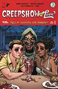 Creepshow In Love #1 (Image Comics/Skybound): There’s three stories in this Valentine’s one-shot of the anthology Creepshow series. The first story and the last story are both decent, with the former being written and drawn by Mirka Andolfo with co-colorist Chiara Di Francia and letterer Pat Brosseau while the latter is co-written by Yul-Pyeong Oh and Pure, with letters again by Brosseau. The reason I wanted to write about this comic, however, was the middle story, which is written and illustrated by Patrick Horvath, again with letters by Brosseau. Horvath broke out last year with the childhood’s book aesthetic serial killer comic, Beneath The Trees Where Nobody Sees (review), but in recent months he’s now established himself as maybe the most exciting creator for one of the many (many) horror anthologies in comics these days. He had an awesome story in DC Horror Presents… #3, and another one in this issue of Creepshow, about aphrodisiacs and being careful what you wish for. It’s a good one, and this issue is worth picking up for it alone. —Zack Quaintance
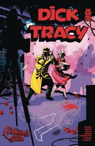 Dick Tracy — Valentine’s Day Special #1 (Mad Cave Studios): I just wanted to check-in here with Dick Tracy generally, and note that I think this book is stellar, an absolute treat for even super casual fans of the character with minor familiarity (which describes me). The Valentine’s Day Special is a fun deviation from the excellent ongoing storyline. The first story, Hollywood Babylon, is by the book’s usual creative writers Alex Segura, Michael Moreci, and Chantelle Aimee Osman, who are joined by artist Craig Cermak. The second story is Heartbreak Alley by writer Steve Orlando, artist Brent Schoonover, and colorist Mark Englert. Both stories are lettered by Jim Campbell. And both stories are a lot of fun. I should say, though, that I thought the art by Schoonover and colors by Englert were absolutely exceptional in the second piece. Anyway, if you’re even a little Dick Tracy curious, you should be reading this great book. —Zack Quaintance
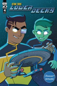 Star Trek: Lower Decks #4 (IDW Publishing): And so arrives Star Trek: Lower Decks Part 2 of “Nature Abhorrent,” once again written by Ryan North with art by Jack Lawrence, colors by Charlie Kirchoff, letters by Clayton Cowles and design & production by Johanna Nattalie. This issue takes full advantage of the two-part format the IDW series has been adopting by throwing the crew right into the action started last month. Not only does this mean the story can immediately get underway, it means the jokes can, too — and as such, this may be the funniest issue yet. Both the dialogue and the bottom-of-the-page text hit the ground firing on all cylinders. I particularly enjoyed an unexpected pop culture reference in the bottom-of-the-page text early on, as well as the name of a Klingon ship. Plus there are some laugh-out-loud observations about the sequential graphic narrative format. Concurrently, the story is interesting and science fiction-y, following up on a different facet of the conflict than was introduced in the previous issue. It was nice to have an issue that gave Tendi and Rutherford such large roles, a benefit of the ongoing format. And the conclusion is unexpectedly poignant and regrettably relevant. As usual, the Badgey recap page is excellent, and my biggest complaint continues to be the lack of back matter (I will keep repeating this; I dream of more Cerritos food replicator ads). Nevertheless, this series continues to be a worthy complement to one of the best shows to ever trek through them stars. Do not miss it. —Avery Kaplan


FOC Watch
These books are currently available for pre-order now.
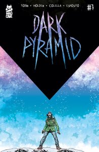 Dark Pyramid #1

Writer: Paul Tobin
Art: PJ Holden
Colors: Sara Colella
Letters: Taylor Esposito
Publisher: Mad Cave Studios
Review by Clyde Hall
Hooky Hidlalgo’s amassed a very dedicated online viewership. As an adventurist, he’s chosen as his latest daring feat a solo climbing expedition up Mt. Denali in Alaska. And he livestreams this solitary, unassisted feat of rock climbing for the at-home audience, which includes his girlfriend, Becca Burgos. After taking a fall, Hooky reorients himself to continue but stumbles across something completely unexpected: A hidden dark pyramid covered in strange hieroglyphs. Still livestreaming, he enters the foreboding structure and narrates what he sees within the deep shadows of the pyramid’s interior. Narration that becomes panicked cries just before Hooky’s feed goes dark.
With viewer funding and online donations, Becca arrives in Foothorn, nearest Alaskan settlement to Hooky’s Denali ascent, a day and a half later. She’s determined to find him and get answers regarding the dark pyramid. But there are obstacles. Locals may know more about the mystery structure than they admit to. And Hooky’s fans have descended on the town as well, taking up all the small town’s lodgings and accommodation.
This five-issue miniseries accomplishes in its premiere something I love in supernatural mysteries. That is, it constructs a realistic world as the setting. If the official line of the local law enforcement tracks, and if morbidly curious online viewers act on fannish impulse, and if a very worried girlfriend lets her concern overrule good judgment, admit it. You have a reasonably plausible background for all that’s to follow. And with that, writer Paul Tobin can bring forth supernatural threats that share the plausibility. If the world depicted is so very real, how can creatures bumping furiously in the night be anything less?
The first Tobin series I read was Bunny Mask back in 2021, and he was already adeptly juggling the everyday with the extraordinary in his horror tales then. If anything, he’s become even more practiced since. This introduction issue sketches out the situation masterfully and immediately hits Hooky’s trail running.
Maybe the best illustration of this talent is in Becca’s first contact with the Foothorn Territory Police. She’s mortified to discover they didn’t send out a search party after Hooky’s live feed went dark. And yes, they seemed aware of the situation sometime after the fact. But with a brutal storm coming in, the search-and-rescue folks reasoned that endangering many people to find a foolish outsider who rejected common safety precautions of a team, equipment, or climb partner would be equally foolish. It’s real-life reasoning I’ve seen before, and it’s hard finding fault when people have willingly placed themselves into dangerous situations for fame or profit. If a tourist unfamiliar with the terrain unwittingly became endangered, the same rescuers would move heaven and earth. An influencer betting solely on his own skills to wow his audience? Less so.
Becca’s response is equally understandable. Someone she cares deeply about may be injured or dying, so she’s going out to look even if she has to go alone, approaching storm be damned. Which she’s advised against by authorities, given how that same mindset served Hooky. And even Becca must admit, on further reflection, it’s not an unreasonable outlook. Naturally there’s a lot more than this going on under the table regarding the locals, and the true dangers of Hooky’s discovery and Becca’s predicament begin surfacing soon after.
PJ Holden on art further grants the story a realistic, lived-in aesthetic which devolves into grotesquery and horrific imagery later on, when the time of soul-swallowing secrets wrapped in Denali’s shadow arrive. It’s also good seeing PJ indulge us with background details in nearly every panel. The setting is vast, even for the great outdoors, and the wilderness of Foothorn may well turn out to be a character in itself. This background detailing helps breathe life into a scenic landscape, one it’s easy to believe outsiders would get lost in.
Sara Colella’s colors deserve a mention as well. In this kind of horror story there’s a time for dusky surroundings, indoor and out. There’s also time of sunlight reflected like a spotlight off snow-covered peaks and mountain passes. She delivers both with equal skill, and her work on the lighting grants the book another refined layer of realism.
Part of the mystery presented in Dark Pyramid rests in its intended scope. Despite the mountainous terrain, wi-fi and streaming work. Images of some sort of lost, ancient structure have hit the internet because of it. Will Becca be livestreaming Things Humankind Was Not Meant to Know? And if so, how will the world be changed in the wake of nonhuman, maybe nonmortal, entities slithering among us? Satisfying answers to questions like these might elude many writers of modern horror. However, this creative team is up to taking the storyline that direction if they choose. And that should tell you white knucklers all you need to know.
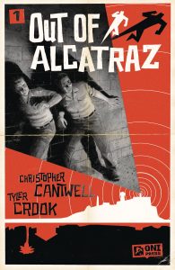 Out of Alcatraz #1

Writer: Christopher Cantwell
Illustrator: Tyler Crook
Publisher: Oni Press
Review by Clyde Hall
Between the evening of June 11th and the early morning of June 12th, 1962, three convicts serving time at the Federal Maximum Security Penitentiary on Alcatraz Island – Clarence Anglin, John Anglin, and Frank Morris – broke out of their cells and escaped the Rock using an improvised raft. Despite no bodies being recovered from San Francisco Bay, the official finding was that all three drowned. This five-issue miniseries launches with a premiere that’s lean on how the famous escape was planned and carried out, but what may have happened if reports of their death were unfounded. And that’s okay. The planning and escape execution have been examined in multiple documentaries and dramas. Presented as it is here, the comic may prompt readers to find out more about the prison and its broader history, including the Battle of Alcatraz in 1946.
Writer Christopher Cantwell explores not only speculation regarding how some of the escapees may have survived, but more interestingly, how they escaped going back to prison. Because inventive and determined people like these three, they can overcome incredible obstacles with a fixed goal in sight. But changing their nature once free, distancing themselves from the lifestyles and crimes which got them caught in the first place? For many, that’s like changing your DNA. It’s not that easy, as any fan of Better Call Saul can attest.
And Cantwell has done due diligence examining and assessing common threads in how other successful prison escapes were accomplished. The writer is, however, a prisoner of certain facts and details regarding the case. It’s a limiting factor. One that tamped down twists and reveals which might otherwise have been surprising, except that they help his fiction align with history.
Despite this, Cantwell fills out unrelated fictional nuances skillfully, ones which are plausible and speak to the era’s morals and mindsets. These extend into the ranks of the lawmen and agents working the case. His examinations of the convict’s personalities, particularly regarding Frank Morris, not only work but become reasons the aftermath details unfold slowly and cautiously. It’s a tact that someone as wily as Morris would undoubtedly ply as a primary key to staying outside penitentiary walls. It also allows mystery bent into hooks for the reader.
Tyler Crook’s cover is a tribute to Hitchcock’s Vertigo movie poster by Saul Bass. His interior work captures the same feel but with a layer of gritty 1960s realism overlying any flashy showbiz pretense. Crook spent time studying mugshots, evidence photos, and everyday items found in the era’s motels and bars, and it shows. None of it edges out impressive expression work when it comes to the characters, though. Moods of both the convicts and those they encounter while securing lasting freedom turn on a silver ‘60s dime. Crook capitalizes on every capricious whiplash, jovial to jeering, loquacious to lethal.
The final product is good storytelling bolstered by the right art style as reasons enough to pick up the next installment. The one drawback? It could be too history based for casual readers, but too fictional for those who like historical mysteries. If you land anywhere between, however, Out of Alcatraz is a new title worth exploring.
The Prog Report
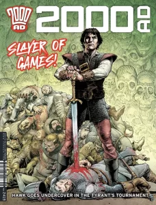 2000AD 2419 (Rebellion Publishing): Last week, I was too distracted by Full Tilt Boogie and Fiends of the Eastern Front to even note that a new Judge Dredd story got underway, but that happened with Judge Dredd: The Shift by writer Ken Niemand, artist Nick Percival, and letterer Annie Parkhouse. It’s horror Dredd, involving an urban legend elevator that is probably up to some kind of supernatural or multi-dimensional hijinks. There’s some very cool imagery in this one, particularly when Dredd himself is on the elevator and then again as he steps off. This one is quite a bit different from the recent Dredd stuff I’ve enjoyed, but I’m game for it. I feel like the best is yet to come with this story, and the first two chapters have been setting things up. Meanwhile, every week I think I’ll get tired of praising Hawk the Slayer and Fiends of the Eastern Front in this space, but they go and continue to be great. Hawk makes wonderful use of the two-page spread in this week’s strip to emphasis some of its grandeur. Fiends, meanwhile, serves up a frog monster v. vampire battle that is as great and comic book-y as it sounds, all with a nice character moment for one of the story’s other protagonists. No notes on either Hawk or Fiend, which have gotten The Prog off to a wonderful start this year. This week’s cover (above) is by Cliff Robinson with colors by Dylan Teague. As always, you can pick up a digital copy of The Prog here. —Zack Quaintance

Read more entries in the weekly Wednesday Comics reviews series!
Next week, The Power Fantasy #6 launches a new story arc, Godzilla Heist #1 arrives, and more!
Source link