
Doom Patrol was pretty much always a weird book.
It didn’t much matter who was writing the title, it would be offbeat, with quirky characters. Grant Morrison and Richard Case elevated that weirdness almost to an artform. They injected those strange superheroes with some mind-bending philosophy and literary ideas to craft one of the single best comics runs.
Following on from that would understandably be a daunting task. Even under the new Vertigo banner with potentially an increased license for weirdness and complexity. Rachel Pollack smashed it.
“I need the Doom Patrol now!”
Doom Patrol #64 gave us the first part of “Sliding in the Wreckage” by Pollack, Richard Case, Stan Woch, Tom Ziuko, and John Workman. As the title would suggest, it’s a riff on Morrison & Case’s first arc, “Crawling from the Wreckage”, and helps indicate that in some ways this is a further elaboration on the earlier work. And maybe a bit of a step sideways.
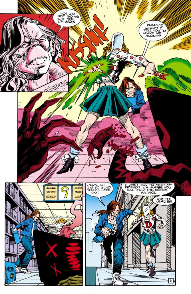
At the start of this run, it was definitely something best understood in relation to what had come before. Although you can start here, the changes to the characters and the evolution of the book make the most sense in relation to earlier stories. In a similar fashion to what happened in Morrison & Case’s run. The team was left disbanded and this story starts with Dorothy Spinner, just trying to survive a cruel world that is constantly dragging her down for her appearance. And her imaginary friends, some of which are less than friendly.
The artwork here from Richard Case and Stan Woch maintains a consistency from Case’s earlier run. Case would only be on for part of one more issue after this, handing off art duties to Linda Medley, but this served as a nice transition into the new run. Case’s style, his angles, character designs, shadows, and layouts are part of what I consider a quintessential early Vertigo look. The designs for Dorothy’s imaginary constructs are particularly haunting.
Tom Ziuko provides guest colours for this issue, following a similar minimalist colour palette that regular colourist Daniel Vozzo provided for the series. It adds a nice creepy atmosphere to the story. And John Workman provides his trademark lettering style. The word balloons for the imaginary friends standing out.
“We are the wetness who burn in the curse.”
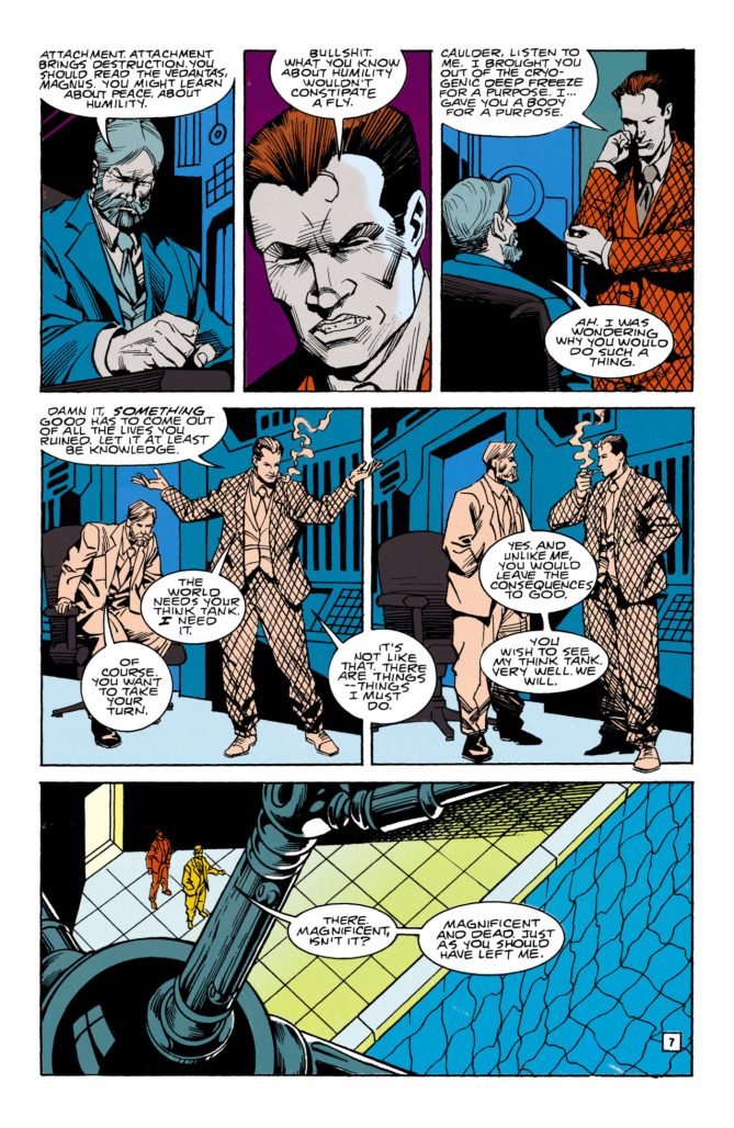
Doom Patrol #64 by Pollack, Case, Woch, Ziuko, and Workman kicked off a run that was transcendent. It started with the idea of a weird, found family of Dorothy, Cliff, and Niles Caulder and expanded from there. There was an overt message of change and transformation throughout Pollack’s run. She was joined by other luminary artists like Medley and Ted McKeever over the course of it as they created something special.
Like Sandman, the run beautifully showcased what you could do with imaginative reinterpretations and permutations on myths and legends. The “Tiresias Wars” arc itself remains one of my favourite pieces of fiction with how it plays with ideas of identity, transformation, and understanding through the lens of both the Tiresias myth and a kind of Tower of Babel as applied to superheroes. Complete with a starring role for DC’s first transgender superhero.
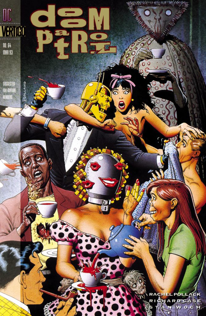
Classic Comic Compendium: DOOM PATROL #64
Doom Patrol #64
Writer: Rachel Pollack
Artists: Richard Case (layouts) & Stan Woch (finishes)
Colourist: Tom Ziuko
Letterer: John Workman
Publisher: DC Comics – Vertigo
Release Date: February 4, 1993
Available collected in Doom Patrol by Rachel Pollack Omnibus
Read past entries in the Classic Comic Compendium!
Related
Source link