
We are back, back, back for another edition Box Art Brawl!
Last time we matched up three regional covers for the DS’ Super Scribblenauts and it was North America’s character-focused design that walked away with the win, receiving 55% of the vote. Europe followed in second with 33% while the Japanese variant brought up the rear with 12%.
This time, we’re heading back into the sewers as we match up two different covers for Konami’s totally bodacious SNES fighter, Teenage Mutant Ninja Turtles: Tournament Fighters (‘Teenage Mutant Hero Turtles‘ for those in Europe and ‘TMNT: Mutant Warriors‘ in Japan — yep, it’s confusing). Released on the SNES in 1993, this was one of a trio of games that Konami developed for the NES, SNES and Genesis respectively, each with their own unique story and characters. You can check out all versions on the brilliant Cowabunga Collection, we might add.
With Europe and North America sharing almost identical covers this time (aside from the title change, obvs) we have ourselves a good old-fashioned head-to-head with the spicy Japanese design. Let’s check them out.
Be sure to cast your votes in the poll below; but first, let’s check out the box art designs themselves.
North America / Europe
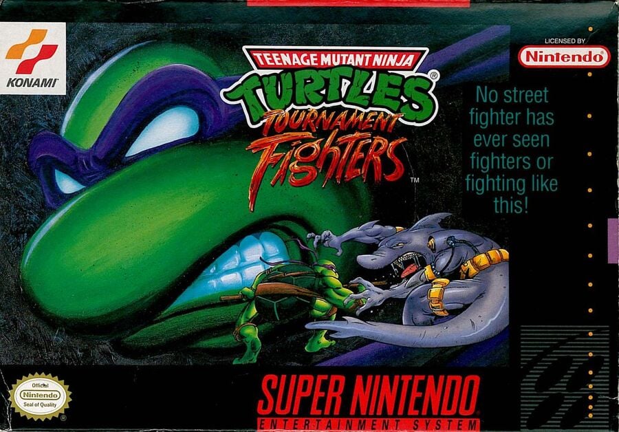
It’s gritty. It’s dark. It has surprisingly little focus on actual fighting. This cover is dominated by a grimacing Donatello in the background as a much smaller sprite faces off against Armaggon in the bottom right (the NES and Genesis versions had a similar format but with different match-ups — Leo vs. Hothead on NES and Raph vs. Triceraton on Genesis, if you’re wondering). It’s all pretty nice, though that slogan of “No street fighter has ever seen fighters or fighting like this” could do with an edit.
Japan
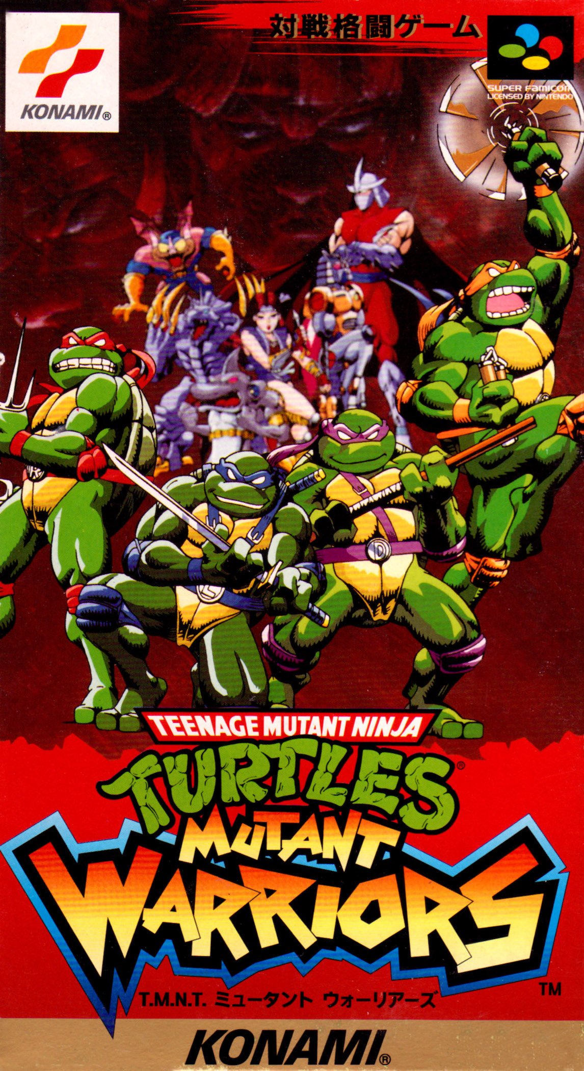
Japan’s design goes for something completely different. The dark tones are here replaced by vibrant reds as the four Turtles stand front and centre while a collection of their enemies lurk menacingly behind them. It might lack some of the grit of the former cover, but we like how eye-catching this one is and it’s interesting to see the Turtles looking like their 2003 animated counterparts a decade earlier.
Thanks for voting! We’ll see you next time for another round of the Box Art Brawl.