
Be sure to cast your votes in the poll below; but first, let’s check out the box art designs themselves.
North America / Japan
This design sure is an interesting one, mostly due to how little there is going on. Our protagonist, Terry, takes pride of place in the foreground while a cracked reflection appears alongside, but that’s about it. What’s interesting here is that, despite its simplicity, it doesn’t necessarily feel empty. A protagonist and a cracked reflection, eh? What’s it trying to say? You’ll have to play the game to find out…
Europe
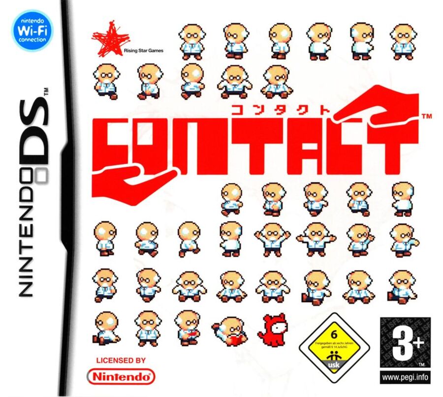
Asking a potential buyer a question with the cover art is all well and good, but do you know what else sells? Cute pixel art — something that the European cover brings in droves. This one features the game’s central professor in just about every position imaginable and there’s even his sweet pup. What more could you want? We are particular fans of the title art here too, with the two out-stretched hands really hammering home the titular contact.
Thanks for voting! We’ll see you next time for another round of the Box Art Brawl.