
This week’s main review is 7174 AD #1. Plus, the Wednesday Comics Team has its usual rundown of the new #1s, finales and other notable issues from non-Big 2 publishers, all of which you can find below … enjoy!
 7174 AD #1
 7174 AD #1
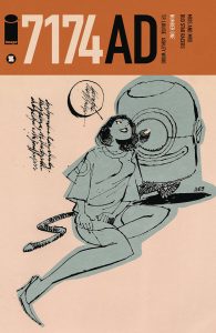
Creators: TP Louise & Ashley Wood
Publisher: Image Comics – Syzygy Publishing
Review by Tim Rooney
7174 AD is a collection of stories from Australian artist Ashley Wood and his creative partner, writer TP Louise. While this isn’t Wood’s first work in comics, I’ve only been familiar with his art through his illustrations and design work for Metal Gear Solid and the 3A line of toys. His eclectic style, a loose and expressionist mix of traditional and digital media, makes for striking and distinctive visuals. This isn’t a book to race through, it’s one to absorb and admire for its design and craftsmanship. This first issue collects two stories, the first chapter of a gritty modern noir, “Duostar Racers”, and a collection of playful erotica strips, “Miss and Mrs.” The physical collection is presented in newsprint but even the digital version is full of texture and grit, with splatters of black and gray and messy, angular screentone.
The highlight here is the first chapter of “Duostar Racers.” The messy, kinetic inks bleed through and off of the page, granting motion and energy to the urban intrigue and speed of the racers and criminals darting through the night. Wood’s work revels in the use of negative space, merely hinting at panel borders through shade and tone. His cities are built on the dark of night, with the lights barely cutting through the oppressive inkwork. He invites the reader into the page, to explore the darkened alleys and highways of his desolate urban nightmare, where the shape of the city is only hinted at through the smog and smoke. The characters in this story are thin, mere suggestions like Wood’s cityscapes. But Louise’s scripting doesn’t tread into hackneyed cliche. The dialogue is melodramatic and grand, and it has to be when paired with the propulsive art. These dynamic and shifting figures cannot stand around and discuss dinner plans. Every line must be life or death.
“Miss and Mrs.” is not bad, but it is a particular brand of off-color cheekiness that is better left in 2011 when they were first created. The same loose style is present here, but even more experimental. There are some fun and creative uses of the medium but these strips are little more than a series of disjointed ideas strung together.
As much as I enjoyed this book, some might find the loose and gritty style difficult to parse or enjoy. It does not adhere to traditional rules of comics layouts and pacing. Those open to the experience of the art will love it, but it’s not going to be for everyone.
Verdict: STRONG BROWSE
Wednesday Comics Reviews
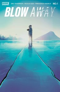
 Blow Away #1 (BOOM! Studios): At a time when essentials and luxuries are simultaneously at a premium, $5 USD is a hefty price tag for any comic book [and also the average, unfortunately], especially so for 22 pages of neo-noir thrills. With such an upfront cost to support a book monthly, if the book itself doesn’t feel appropriately stuffed with narratively reinforcing tidbits and intentionally slower storytelling to reduce its 22 pages into a done-in-one, then the book can feel barren and wasteful. Hell, there’s a justifiable case to be made to trade-wait floppies that use their monthly publishing to exchange 1/5th a novella for direct market relevancy– the cumulative price of a miniseries in monthly installments can trend to 40% more expensive than its paperback price. So, in the case of Blow Away: it’s a taut neo-noir aping the exact themes of its cinematic predecessors Blow-Up and Blow Out where someone recording a form of data might have possibly recorded an illegal activity, but in delving deeper into their newfound conspiracy, loses sight of reality. It’s an amazing formula beautifully brought to form by Zac Thompson’s inner monologue and the sharp, cold inks of Nicola Izzo’s pen. But this opening foray is novella paced, so after 22 pages, not much has happened to progress the plot or character arcs. This is intentional, but unfortunate in today’s overly expensive direct market. I wish that I could justify an early look at the cold atmosphere rendered beautifully with large, chunky Gaussian blurred snow specks by colorist Francesco Segala and assistant Gloria Martinelli; not to mention the sharp-edged font choice made by DC Hopkins of Andworld Design that naturally sells a harsh, dangerous reality. But the price of monthly admission sadly feels crueler than the narrative, so I’m left in the cold until the trade comes to bear, because once that paperback drops, I will be there no matter what [price tag pending]. —Beau Q.
The Prog Report
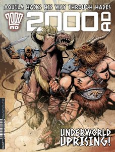
 2000AD Prog 2378 (Rebellion Publishing): It’s always fun when a new story kicks off in the magazine, and that’s what we get this week with the start of Brink: Consumed, by writer Dan Abnett, artist INJ Culbard, and letterer Simon Bowland. Brink is a returning series, in which human beings have evacuated Earth (environmental catastrophe caused by industry, naturally) and now live in what are essentially space stations. This first chapter is intriguing enough, setting quite a bit up without feeling dull. The first page is your intriguing hook for this story, and I won’t spoil it. But moreover, for me Culbard is a very interesting artist, and Abnett is a polished and nuanced storyteller. I’m excited to follow this new volume of Brink. As always, you can nab a digital copy of this week’s Prog here. —Zack Quaintance
Read more entries in the weekly Wednesday Comics reviews series!
Related
Source link